
This series is split into four guides. In order, they are: Getting the Right Density, Linearization, Tonal Separations, and Printing in Color. Total length of the series is 291 pages.
Videos
Apart from the four guides, there are several videos that cover the digital parts of the process. The videos are titled, Calculating Exposure Times, Linearization, Making a Proofing Station, Split Tones, Making an ICC Profile, and Preparing an Image to Print. The information from these videos is also written out as step by step instructions throughout the series.
Excel Programs
Calibrating a print, especially in color, requires a number of calculations. There are three Excel documents that come with this series, to automate that process. All you need to do is copy and paste values and Excel will do the rest. The documents are: Exposure Times, SCTV Linearization, and Solver.
Documents
This series comes with a number of documents: test charts, profiles in CMYK, CMYK+1 and CMYK+3, a registration mark, many separation curves, and sample data.
Why Calibrate a Print?
A well calibrated workflow will allow you to predictably print a digital interpretation of your photograph. An un-calibrated print might come out too light or with too much contrast compared to what you had hoped for. This results in frustration and high costs in having to remake negatives and the print. Good calibration will eliminate trial and error from your workflow.
Simple to Complex
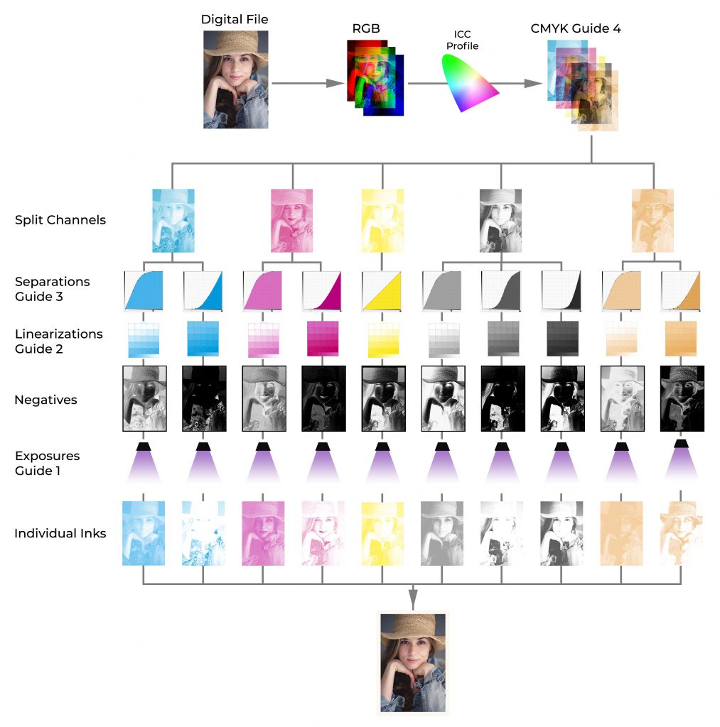
This series will cover everything from the simplest workflow, shown below.
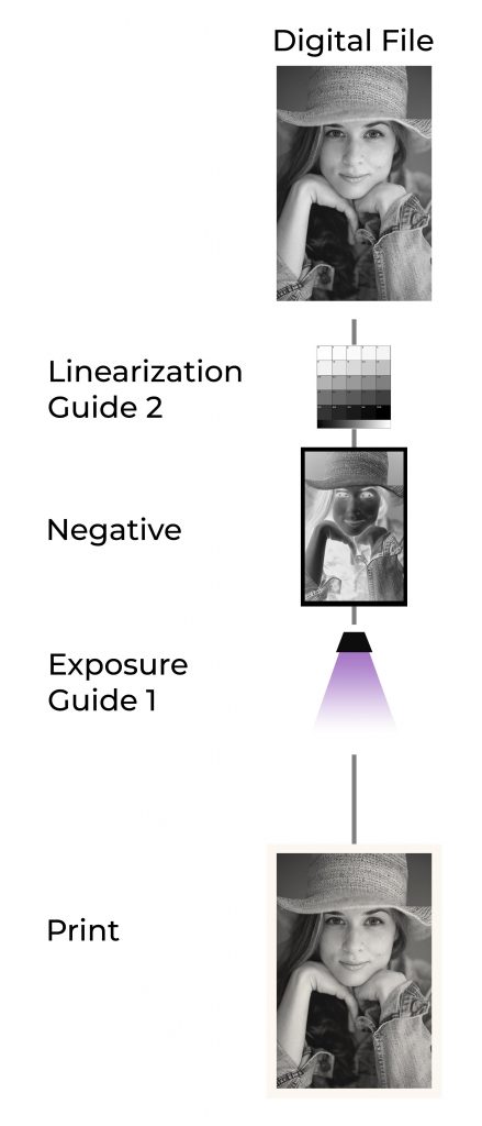
To more complex workflows and even beyond what is shown below.
Price 59.95€
If you are a student, contact me here for a discount.

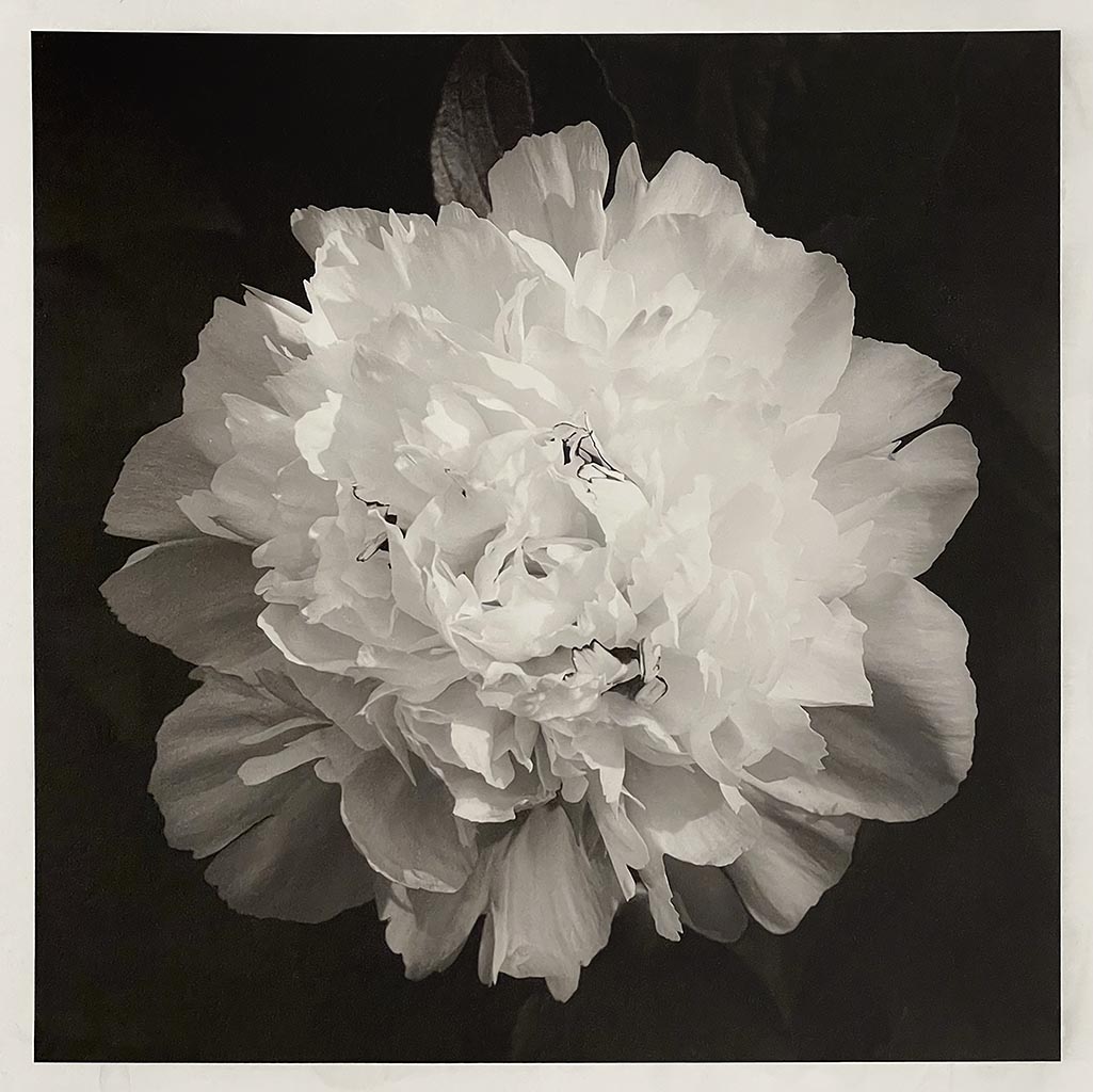

This book includes detailed step-by-step instructions on how to use the gum process to make prints like those shown below. More importantly, we will take a deep dive into understanding the interconnected variables of the gum process. The objective is to supply you with the tools needed to either create a workflow from scratch or modify your current workflow to achieve a desired result. This book is not intended to be a complete guide to gum printing, but a supplement to current gum printing literature. I recommend using this book as a reference for solving problems or modifying your existing workflow to achieve the results you are looking for.
There are five parts to this book
Part I is a freely available introduction.
Part II covers preparatory work for the main printmaking process, such as sizing paper, registration, and making negatives.
Part III has step-by-step tutorials on gum printing with brush or spray applied emulsions.
Part IV, which covers theory, is by far the most extensive section in this book and aims to minimize frustration in the learning process.
Part V is an overview of how the calibration methods, described in the book Calibration for Alternative Photographic Processes can be applied to calibrating a gum print.
New to gum printing
This book is meant to be a technical guide for people already familiar with the gum process, so some of the basic concepts about gum printing are omitted. If you are new to the process, I recommend starting with one of the modern books on gum printing or, better yet, taking a workshop with a gum printing expert like Christina Z. Anderson, Diana Bloomfield, Tony Gonzalez, Marek Wesołowski, or Ellie Young.
Other pigment-based processes
All pigment-based processes are closely related, so you can take information from this book and apply it to other processes. That’s how I learned gum printing in the first place. I simply applied the knowledge acquired through tens of thousands of hours of experience in carbon transfer printing to gum printing. Many of the working procedures and concepts in this book can be applied to other alternative processes, including gumoil, carbon transfer, direct carbon, and bromoil.
Novel printing methods
I outline solutions to several problems that, as far as I know, have not been solved before. It’s possible some of these methods were invented by someone else, and lost to time, or never made it into common practice. I also implement a couple of different working methods. All of these are covered in the book.
With this book you will have access to:
DAS is often used as a photosensitizer with various proteins and polymers in alternative photographic processes. In carbon transfer printing, DAS makes the gelatin sensitive to UV light and allows for the creation of a photographic image.
DAS (sometimes DAZST-Na) is short for Disodium 4,4’-diazidostilbene-2,2’-disulfonate tetrahydrate (CAS 2718-90-3). That’s not easy to pronounce, but let’s break it down to understand how this reagent helps create a carbon transfer print.
At the base of the molecule is a stilbene dye (stilbenes are eco-friendly and can be found in wine, berries, and other plants). Industrially stilbene is used as a precursor to many dyes and optical brighteners, but in certain applications, it can used to manufacture photosensitizers. Dyes are often a good option for controlling photochemical reactions because they efficiently absorb certain portions of the electromagnetic spectrum, which allows chemists to tune the molecule to react at certain wavelengths. DAS is ‘tuned’ to absorb the UV-Light from a metal halide lamp. Stilbene by itself isn’t enough to sensitize gelatin. Its only purpose is to absorb energy then transfer it somewhere else.
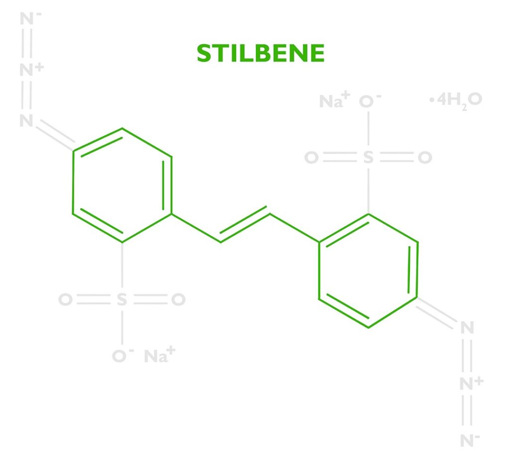
The energy absorbed by the stilbene will be transferred to a photoreactive functional group called an azide. DAS has two of these at either end of the stilbene molecule. See the nitrogen triplets in the photo to the right. Because there are two we’ll say Diazido. Diazo sensitizers are also popular in alternative photographic processes, which are based on two azos N≡N. Both diazos (N≡N) and diazidos (N=N=N) serve the same function.
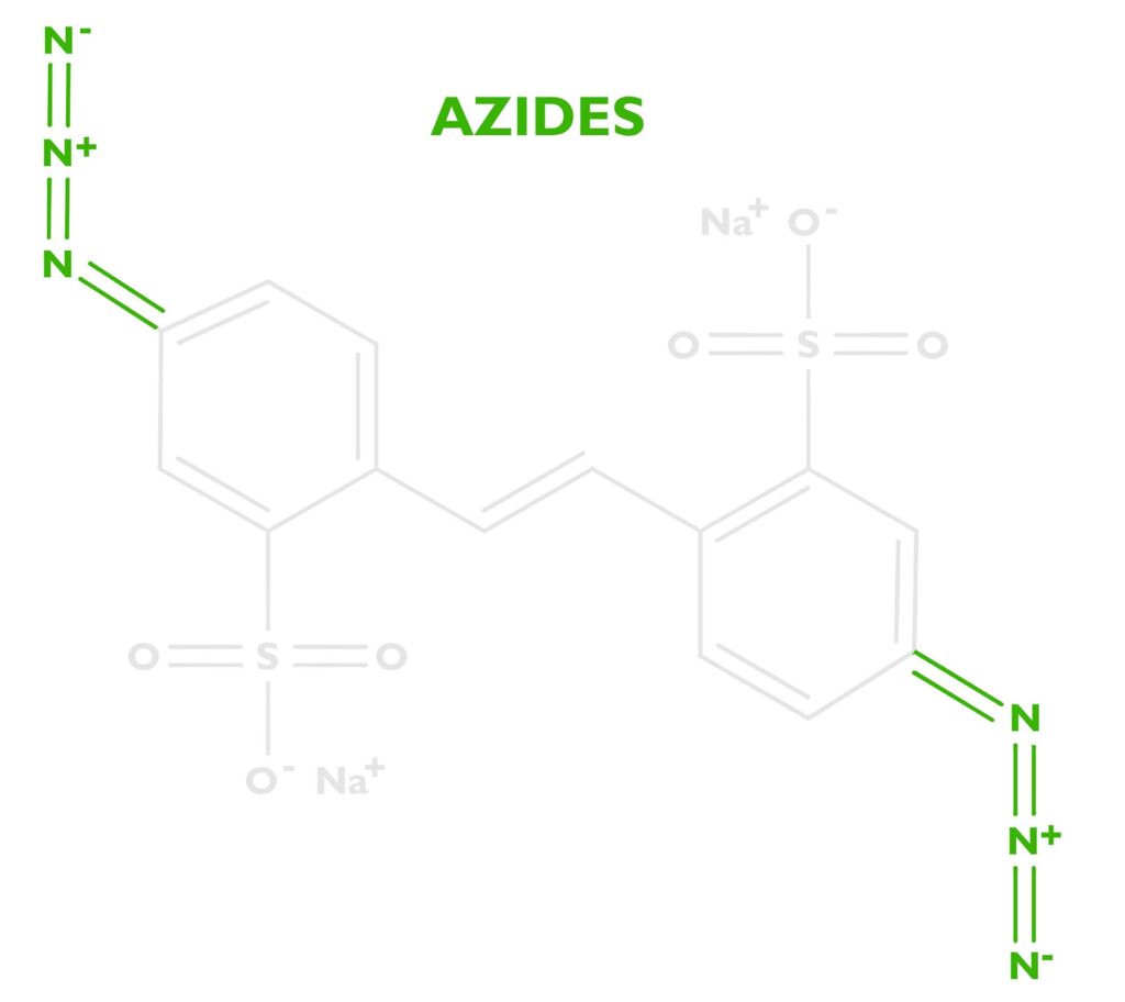
When stilbene pumps enough energy into the azide, the azide releases nitrogen gas N2, leaving behind a free radical nitrene. The nitrene is unhappy since it only has 6 electrons in its outer shell and it wants to have 8, so it’s looking for something to bond with.
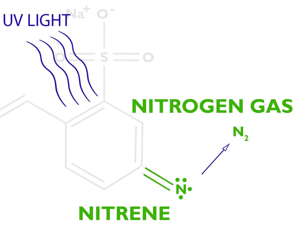
The free radical nitrene is going to covalently bond with the gelatin, inserting itself between a carbon and a hydrogen on the gelatin molecule. See this article on C,H-insertion if you would like to know more.
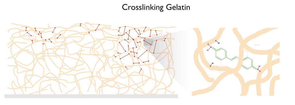
If the crosslinking process happens enough times, the gelatin won’t melt when placed in hot water. Below is a short description of the carbon transfer process to aid in the visualization of how the crosslinking of gelatin allows for the formation of a photographic image. The two videos to the right/below will also aid in visualizing the process.
Stable- In traditional carbon printing, potassium or ammonia dichromate are used to sensitize the gelatin. As soon as the emulsion is sensitized with dichromate, the dark reaction starts. This means the speed of the emulsion is constantly changing. Imagine putting ISO 100 film in your camera in the morning, by late morning it will be ISO 200, by lunch ISO 400, in the afternoon ISO 800, and before you can develop the film it will be completely fogged. Plus, after you expose a dichromate-sensitized emulsion, even after the exposure unit is turned off, the chemical reaction continues. This makes calibration frustrating. With DAS there is no dark reaction and no continuing action of light, so calibration is easy.
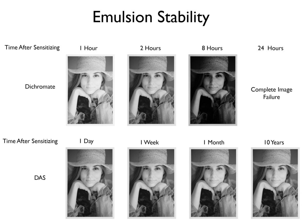
Less Toxic than Dichromates– Potassium and Ammonia dichromate are known carcinogens. The DAS sold by The Wet Print carries the Arts and Creative Institute’s cautionary label because there have been no direct studies on the toxicity of DAS. However, computer modeling I had done by the toxicology department at Duke University and comparison to similar reagents show that the toxicity of DAS is most likely low. Much better than dichromates. That said, I personally still wear gloves when handling DAS and developing.
Smooth Prints– The standard practice in traditional carbon printing is to sensitize the emulsion with a brush or roller. This can easily lead to uneven tone in a print. Since DAS is stable, it can be mixed directly into the emulsion, resulting in a very even distribution of the sensitizer. Below is an example of how smooth DAS-sensitized prints can be.
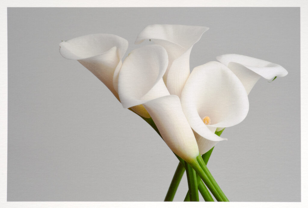
Faster workflow: Since DAS can be mixed into the emulsion, there is no need for the sensitizing step. I just grab an emulsion from storage and place it directly into the vacuum frame for exposure.
When UV light reacts with DAS, three things happen: (If you have ever taken a workshop with me, you’ll be very familiar with these because I drill them into students the first two days.)
Think of any medicine, there is the desired effect and the unwanted side effects. The desired effect of DAS is to crosslink the gelatin, but when UV light reacts with DAS, nitrogen is released and a stilbene dye is left over. Understanding those three products will be crucial to creating a stress-free and successful workflow with DAS.
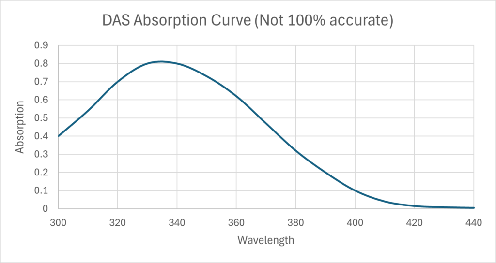
Crosslinking of gelatin. When Disodium 4,4’-diazidostilbene-2,2’-disulfonate tetrahydrate absorbs enough energy, the Azide produces nitrogen gas and a free radical nitrene. The nitrene then crosslinks two gelatin proteins, so the gelatin will not melt in hot water. A concentration of 3g to 6g of DAS to every 100g of gelatin is good. Below 3% there is insufficient crosslinking and the gelatin will melt in hot water. More than 7% and the two side effects, self-masking and nitrogen bubbles, become a problem. The wavelength of your light source must align with the absorption curve of DAS shown to the right. For example, using a 420nm light source will not cause any crosslinking.
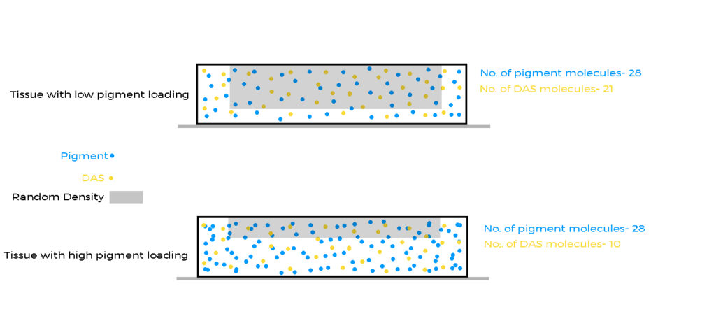
Self Masking. One of the products of the reaction between DAS and UV light is a stilbene dye. This dye is a brown color and very good at blocking UV light. See the illustration below.
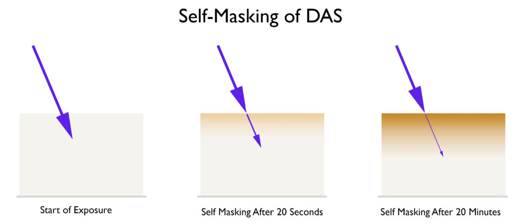
Look at how the dye absorbs more and more UV energy as the exposure progresses. Therefore, more and more energy is needed to penetrate deeper into the emulsion, which is why it can be difficult to achieve a good black, especially when a person is accustomed to working with dichromates and a low-contrast emulsion. The key to getting a good black with DAS is to increase the contrast of the emulsion. This is a double-edged sword. As you increase the contrast of the emulsion, higher densities will be easier to achieve, but the highlights will suffer when using continuous tone negatives. This is one of many properties you will need to balance to be successful in carbon printing, or at least make the process less frustrating. At the end of workshops, I go through a ‘balancing act’ that helps people balance variables like the one above and create a workflow that works well for them. Below are a few ways you can increase the contrast of your emulsion.
Imagesetter negatives make DAS easier to work with because halftone negatives do not have the same problem as continuous tone negatives in the highlights, therefore using a high-contrast emulsion is not a problem. See here if you are unfamiliar with that previous statement. If you are in Europe, you can get imagesetter negatives from www.flexografico.com or www.heinatz.hamburg/computer-to-film/ and if you are in the USA, contact Michael Strickland www.michaelstricklandimages.com. DAS can also be used with continuous tone negatives. It takes more practice than using halftone negatives, but the results are worth it.
Below is a two-layer carbon transfer print made with DAS-sensitized emulsions and a traditional silver negative. The negative was taken by Jim Fitzgerlad.
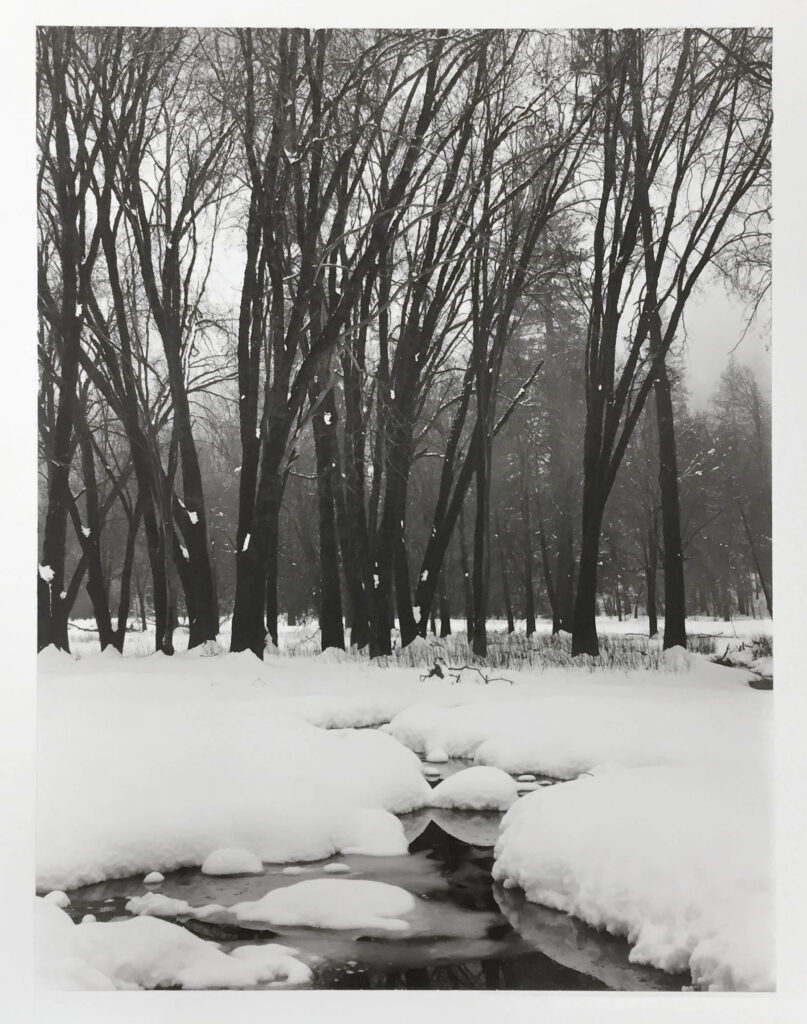
Here’s a print made from a continuous tone inkjet negative and a variable contrast DAS-sensitized emulsion. This was one exposure and one layer. When I start giving carbon workshops again in 2027/2028, I’ll teach how to make variable contrast emulsions.
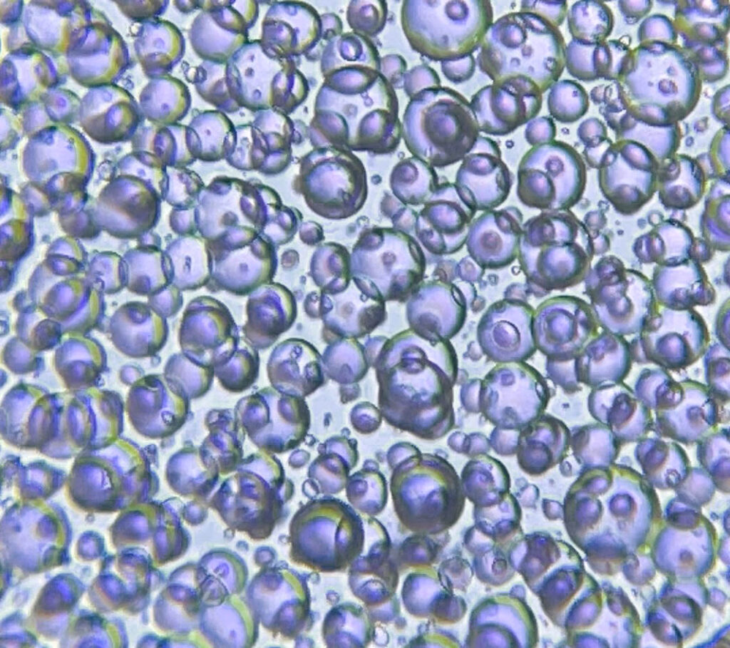
Nitrogen bubbles. The photo to the right shows an extreme example of nitrogen bubbles. The image layer is so thick that the nitrogen was unable to escape and is permanently trapped in the layer of gelatin. Below are two good tricks for controlling these bubbles.
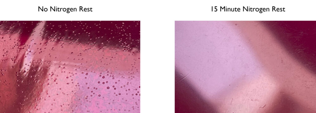
If you do those two things, then you should never have problems with nitrogen bubbles, however, here are some other things you can do.
Staining. One more disadvantage of DAS is the staining of the final paper support. DAS can leech into the paper, then when exposed to UV light, the paper turns yellow. It is important to clear/bleach the paper before exposing the paper to UV light. Some papers are very difficult to clear, but Hahnemühle Platinum Rag is very easy. Another way to avoid sensitizer staining is to make double or triple-transfer carbon prints. Below is the recipe I use to clear/bleach prints. It is adapted from the Ultrastable Process by Charles Berger.
It seems like supplies for DAS are dwindling. Most of my suppliers in Europe have run out of stock, and my last order from Switzerland was a deep brick red, which isn’t ideal. See the differences in color in the photo below. A lighter color means less stilbene dye and a higher quality product.
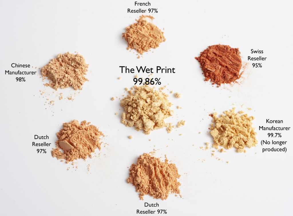
I tried ordering from a manufacturer in China and lost 2,500 euros because the package was ‘lost’ in transit. I suspect that they never shipped it. To solve this problem, in 2023 I put together a group order from one of the last reputable manufacturers. It had to be a group order because the minimum order was 130kg! I ordered 160kg. That’s enough to make well over half a million 8×10” prints. I have 40kg left, of which I’ll keep 20kg for myself as a lifetime supply for the rest of my carbon printing career. The other 20kg I’ve made available on The Wet Print website, and on Amazon for those living in the USA. There are a few other places to purchase DAS (CAS 2718-90-3), but you’ll often pay more, and the purity is nowhere near the 99.86% I got from the group order.
For the very curious reader, let’s go back to the molecule Disodium 4,4’-diazidostilbene-2,2’-disulfonate tetrahydrate. We know now what the diazidostilbene does, but what about the sodium, sulfonate, and water? (Disclaimer- I’m not a chemist, but I think I have pieced together why DAS works so well for carbon printing. If you have any more information, please email me.)
Safety: To improve the safety and stability of the molecule, we want to add more atoms in proportion to the azides. “The “Rule of Six” states: If a substance presents at least six atoms of carbon (or other atoms of approximately the same size) per energetic functionality (ExFG), this should render the molecule relatively safe to handle” (Peer, 1998, 256 – 263). In essence, the potentially explosive azide part of the molecule is diluted, rendering it safe to handle. The extra water (tetrahydrate from the recrystallization and purification step of production) most likely makes it safer as well.
I had flammability and flash point testing conducted by Eurofins, which show DAS is safe to handle with no need for hazmat shipping. It’s about as flammable as most woods. Here are the test results if you are interested.
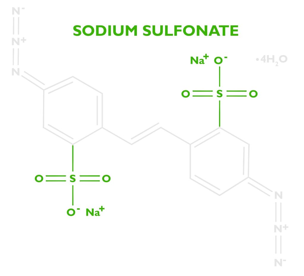
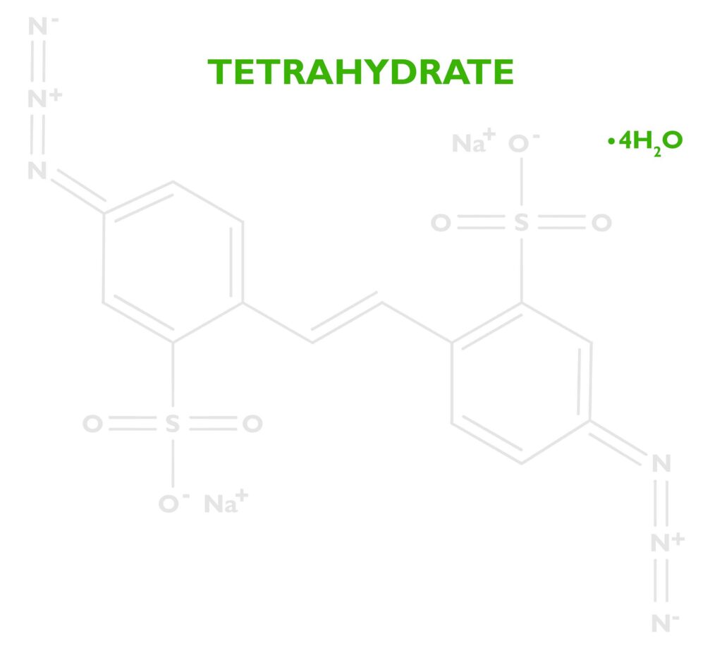
Stability: I have no source for this, but my guess is a larger molecule also lends to the stability of DAS. A stable emulsion will show no change in performance over long periods of time. A small diazido molecule might be too sensitive to heat, or oxygen to create a stable emulsion.
Solubility: Diazidostilbene is a nonpolar molecule, so it’s not soluble in water. Both sulfonic acid and sodium increase the solubility. Kosar states in his book Light Sensitive Systems, that “sodium salts of these acids are water soluble” (Kosar, 1965, p. 331). Since carbon transfer printing is a water-based process, a water-soluble sensitizer is important.
We all have Charles Berger to thank for the introduction of DAS into carbon printing. He invented the UltraStable process, which had emulsions you could purchase to make color carbon prints. The emulsions were pre-sensitized with DAS, and if you can find a box today, they still work just fine. Amazing considering the emulsions would be over 25 years old!
Click here to download the Safety Data Sheet for DAS
References:
Kosar, J. (1965). Light-sensitive systems: Chemistry and application of nonsilver halide photographic processes. J. Wiley.
Peer, M. Spec. Chem. 1998, 18, 256 – 263
Prucker O, Brandstetter T, Rühe J. Surface-attached hydrogel coatings via C,H-insertion crosslinking for biomedical and bioanalytical applications (Review). Biointerphases. 2017 Dec 8;13(1):010801. doi: 10.1116/1.4999786. PMID: 29221372.
To make an alternative process print from a digital file, one has to make a transparency, usually a negative. The most common method is to use an inkjet printer, but an imagesetter offers a much higher quality option.
How are inkjet negatives made? Dots of ink are sprayed onto a transparent film.
How are imagesetter negative made? An extremely precise laser exposes a high contrast silver based film, which is then developed, fixed, washed, and dried just like a traditional analog negative.
Advantages of an Inkjet Negative
Cheap- 2000 euros for a printer, about 12 euros per m2 for a film like fixxons and ink, and 50 euros for Quad Tone Rip.
Fast access to a negative
Disadvantages of an Inkjet Negative
Unsuitable for pigment based processes. Prints will have often have blown out or muddy highlights.
Lower resolution as a result of larger dot size and lower accuracy of dot placement
Poor registration when working with multiple negatives
Difficult to calibrate and less accurate
Scratch and easily show fingerprints
Humidity from ink can affect or even destroy a print
If printing from a roll, the film curls a lot
Newton rings
Brush marks and uneven coating shows up in the print
Advantages of Imagesetter Negatives
Very high resolution.
Perfect highlight rendition in the print. No more blown out or muddy whites.
Easy and accurate calibration
Registration to within a few microns between negatives
Durable, except for DITR film
Disadvantages of Imagesetter negatives
Expensive- 10,000 euros for 30+ year old imagesetter that is constantly breaking, plus chemicals. 50,000 to 200,000 euros for a newer thermal imager, and thermal film is 45 euros per m2. A good RIP and screen will cost another 20,000 euros.
Hard to find
Need to wait for shipping
Visible dots when using larger screens or just one negative.
Below in italics are some short excerpts from the 291 page book “Calibration for Alternative Photographic Processes.” I think you will see that imagesetter films are worth trying. The book goes into much more detail.
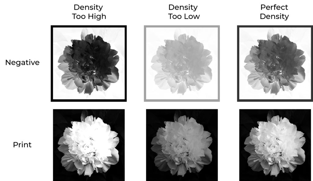
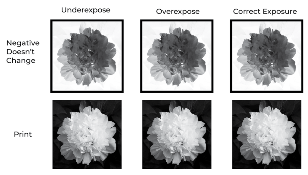
“If you set the density of the inkjet or in-camera negative too high for the process, or the exposure is too short, the highlights in the print are going to be blown out, as can be seen in the print on the left in the illustration above. Likewise, if the density of a continuous tone negative is too low, or the exposure is too long, then the highlights are going to be muddy, as can be seen in the middle print. To get the white point spot on, then the negative has to be perfectly matched to the process. Any difference in the process, for example, with humidity, temperature, exposure, etc. is going to affect the white point.”
With a halftone imagesetter negative, “I can randomly choose an exposure time, randomly choose an alternative process with a random contrast and tonal scale, in a room set to a random temperature and random humidity, and the white point in the print will be absolutely perfect…every single time. This can also be seen in the illustration below, which is exactly the same as figure above but with a halftone negative. I didn’t indicate the density of the negative because that is irrelevant.” The book goes on to explain why the negatives work this way.
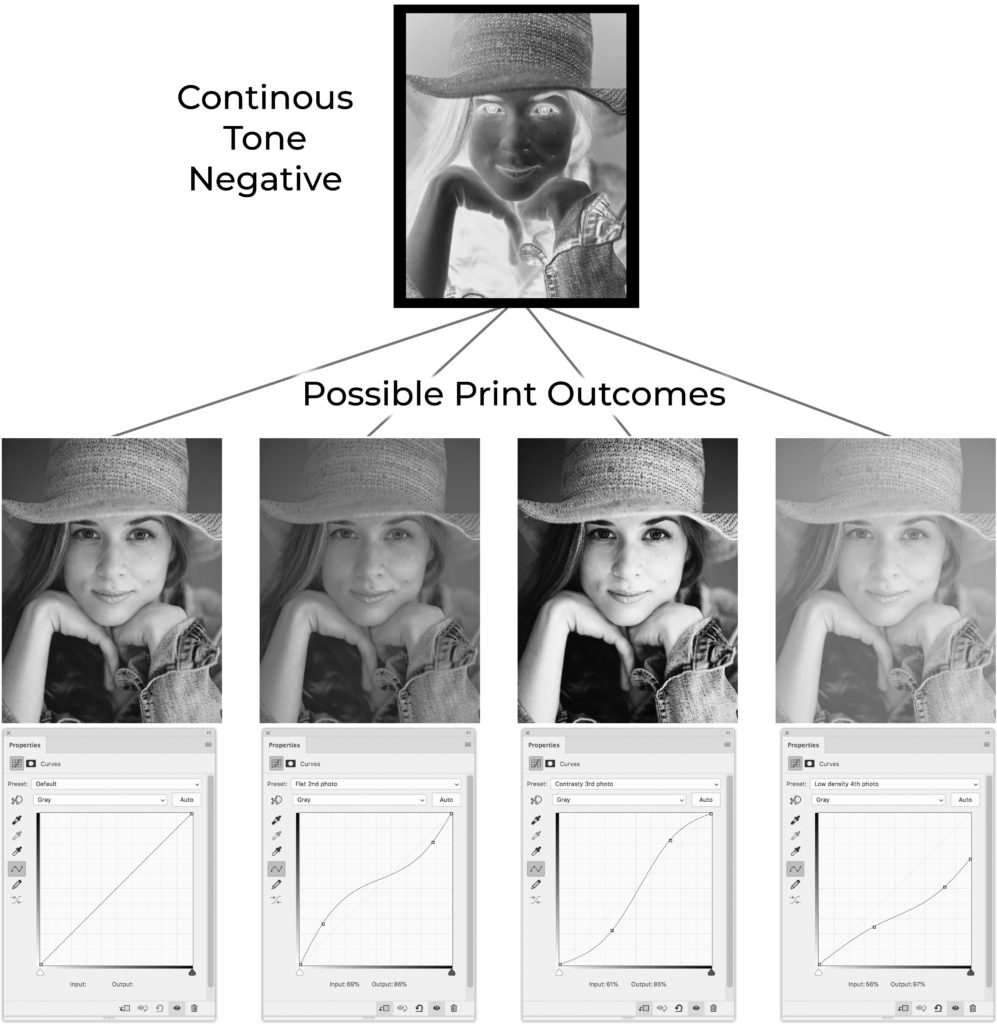
Continuous Tone Negative
“First, look at what happens in a print when the contrast of the process changes while using a continuous tone negative. Notice in the illustration below, how the prints change with the curves adjustments. These curve adjustments represent changes in contrast to the process due to variables like humidity, exposure, and temperature. Maybe you are making a platinum print and the humidity is a little lower than when you made the linearization. This will cause the contrast in the print to be lower and it will look like the second photo. Well, maybe not that bad, I exaggerated the effect for this illustration. For the third photo from the left, imagine you are making a carbon print and one emulsion has more pigment in it, which will cause the contrast to be too high. The fourth print is an example of the contrast lowering so much that it prevents getting a good dMax. In each of these cases, however, the white point is perfectly placed. Which, you would be quite lucky to achieve with a continuous tone negative. Even getting the white point perfectly placed, doesn’t mean the calibration is going to be accurate.”
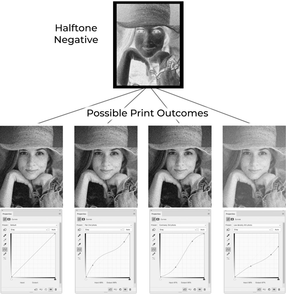
Halftone Negative
“Here’s where people’s jaws drop in the workshops. In the illustration below are the exact same curves being applied to a halftone image. The first three images are exactly the same! This means that even if you are extremely sloppy with the process, not measuring pigments properly, not controlling humidity, etc. The prints are going to come out almost perfectly calibrated. This extends to variations of contrast within an image, which will include things like brush marks from sensitizing. Try printing a perfectly smooth sky with brush sensitized platinum with a continuous tone negative and you’ll be pulling your hair out. Try the same with a halftone negative and it will come out perfectly smooth even if you try to make it come out with some texture. Well, almost. Since the process will affect the dot gain a little bit, variations in the process will cause small variations in the print. However, these variations are magnitudes smaller than those seen in prints made with continuous tone negatives. The last image on the right is well calibrated, but the maximum density is lower.”
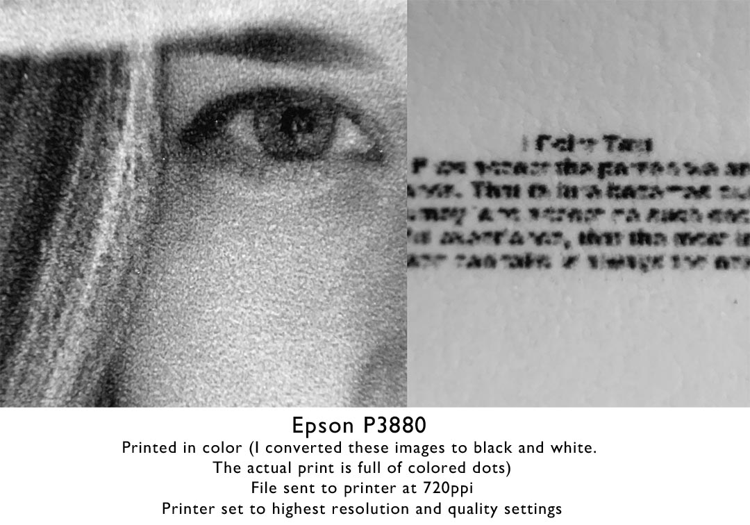
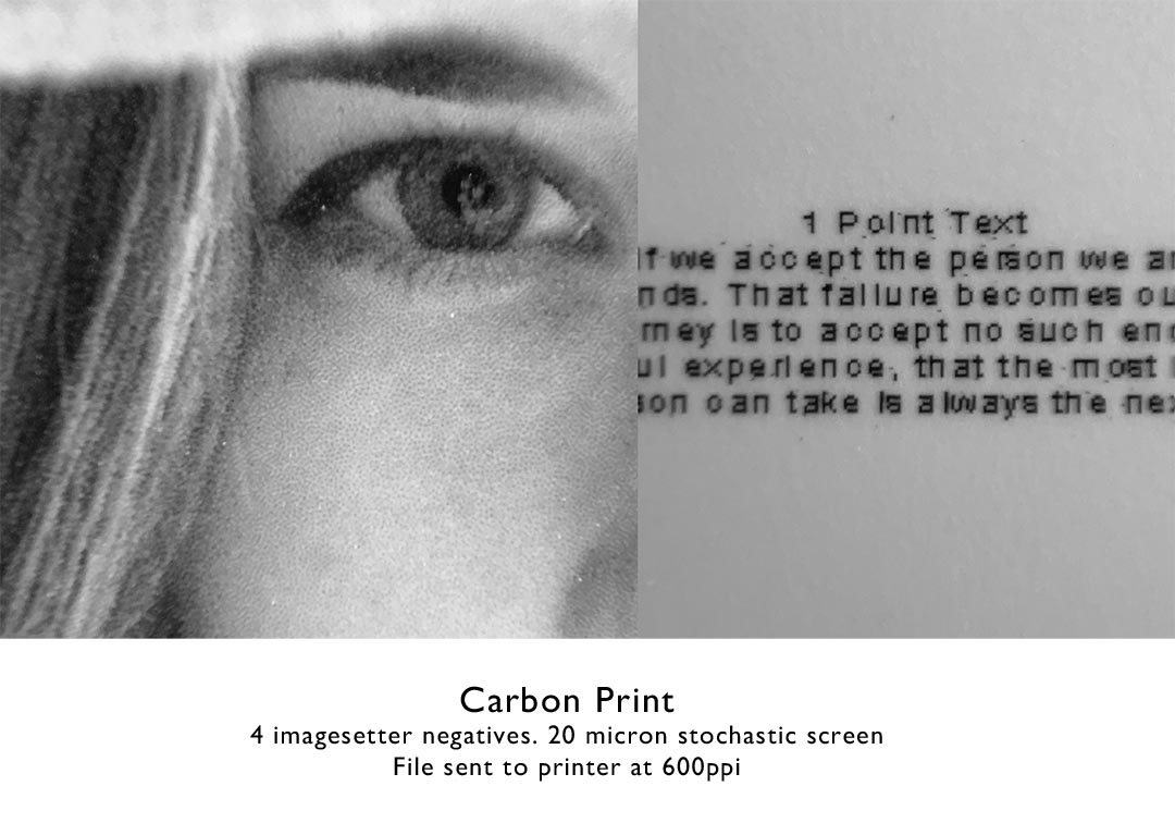
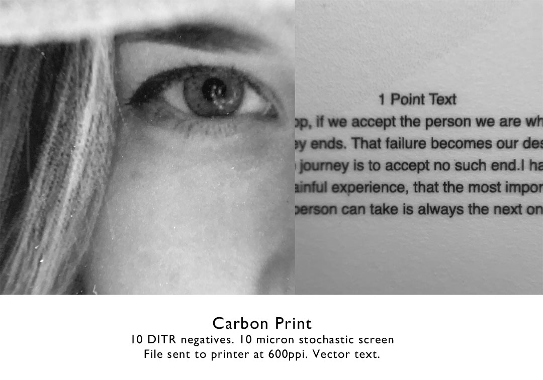
Below are samples of various prints made with different printing systems. The inkjet prints were sent to the printer at 720ppi, while the imagesetter negatives at lower 600ppi resolution. The image below is about 5mm wide, or about 3/16 of an inch.
Epson P20000 with ABW– This was by far the worst of the bunch.
Epson 3880– Normal color printing. I converted the photos of the prints to BW for the website, but the actual print is made up of colored dots.
Piezography– Way better dot placement with a 4900 and QTR than the P20000 with epson inks and rip. Having 7 inks makes a very smooth print. The print is still lacking any definition in the eyelashes and hair.

Imagesetter negative– I made a carbon transfer print with 4 negatives with a 20 micron stochastic screen. The eyelashes are defined and some skin structure is visible. This is the system I use for making black and white prints.
Imagesetter on DITR film– I went a little extreme for this example, using 10 negatives with a 10 micron stochastic screen, but the result is quite remarkable considering the image is only 5mm wide. The text comparison is a little unfair since I used vector text.
If you are in Europe, Flexografico makes imagesetter negatives, and in the USA contact Michael Strickland.
Alternative photographic processes are often very difficult and choosing the wrong pigments can add to the frustration. Ideally each ink, dispersion, and paint would be tested for: staining, transparency, pigment loading, quality of the dispersion, mixability, sedimentation, toxicity, lightfastness, chroma, and for other defects they can cause. This is a hefty financial burden and takes a considerable amount of time. Below are descriptions of the tests I have conducted to find dispersions that work best with the carbon transfer process, but they will also work very well with other alternative processes and artistic ventures.

Testing, testing, and more testing.
STAINING
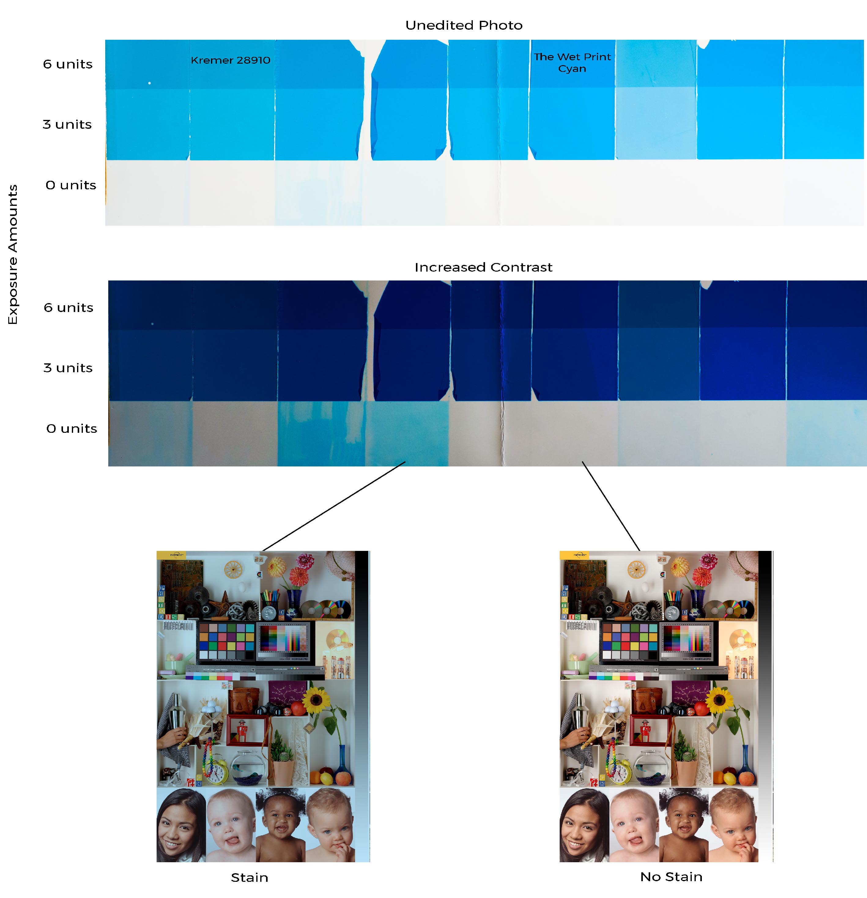
Staining happens when a pigment does not wash off completely during development. In the test above nine emulsions were made with various dispersions adjusted accordingly so that they all had the same amount of pigment. They were exposed for 0, 3, and 6 units then developed on a yupo support treated with albumen. The second photo shows the results with increased contrast. Imagine using the third or fourth dispersion from the left. The prints would have an awful cyan cast in the highlights. The dispersions with the least amount of staining will then be tested for transparency, mixability, chroma, etc… If the results are not good, then the process repeats. Around 40 dispersions were tested for staining of the magenta alone, and well over 100 dispersions were tested in total.
TRANSPARENCY
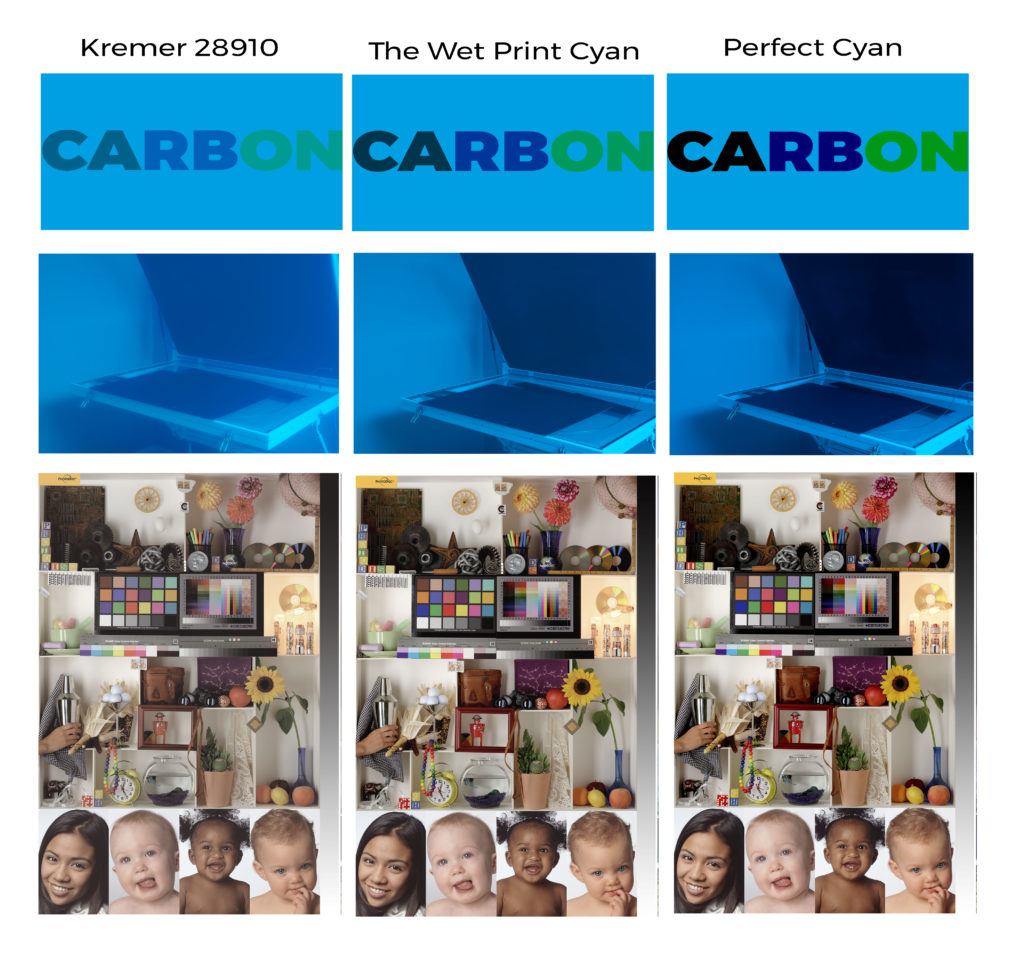
Transparency is another very important factor in choosing a dispersion for printmaking. Let us look at violet color in a print. To create that color cyan needs to be laid on top of magenta, or the other way around. If the cyan is completely opaque it will just cover up the magenta. As the cyan becomes more transparent, it lets more of the magenta through creating a much more vibrant violet. This is true of all color in a print. The higher the transparent of the cyan and magenta, the more vibrant color mixes are going to be. See the photo above. The first row of photos shows the transparency of each dispersion. Notice how the black, violet, and green are muddy in the first photo and how vibrant they are in the last one. In the second row of photos, the dispersions were poured on a temporary support and used as a camera filter. The last row of photos is a digital proof of what a print would look like using dispersions with various opacities.
The opacity of the dispersions is also very important when tinting a black and white emulsion. Using a pigment with poor transparency will reduce the maximum density of the print substantially. See the photo below.
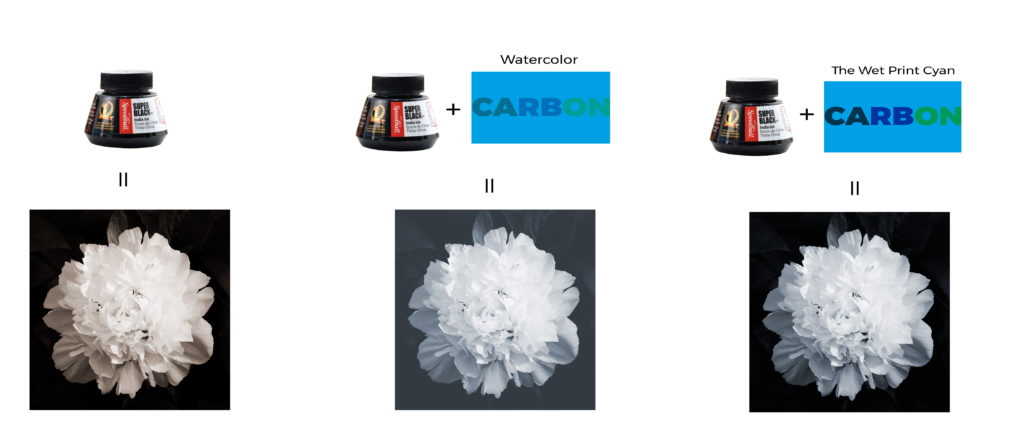
PIGMENT LOADING
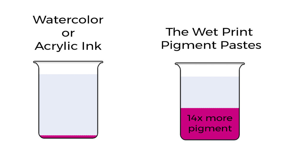
The higher the concentration of pigment in a dispersion, the less is needed to make a print. Look at the cost of 100g of pure pigment. The most common dispersions used to make a carbon or gum print are either watercolor paints or acrylic inks. The concentration of pigment in each is around 3%. To get 100g of pure pigment, about 3333ml would be needed. Watercolor tubes cost about 10 euros for 15ml, and acrylic ink costs about 5 euros for 30ml. The pigment from watercolor tubes would cost a little over 2200 euros, and acrylic inks would cost over 550 euros. The Wet Print color pastes are around 40% pigment, so the cost of 100g of pure pigment would cost between 30 to 145 euros depending on the color.
DISPERSION QUALITY
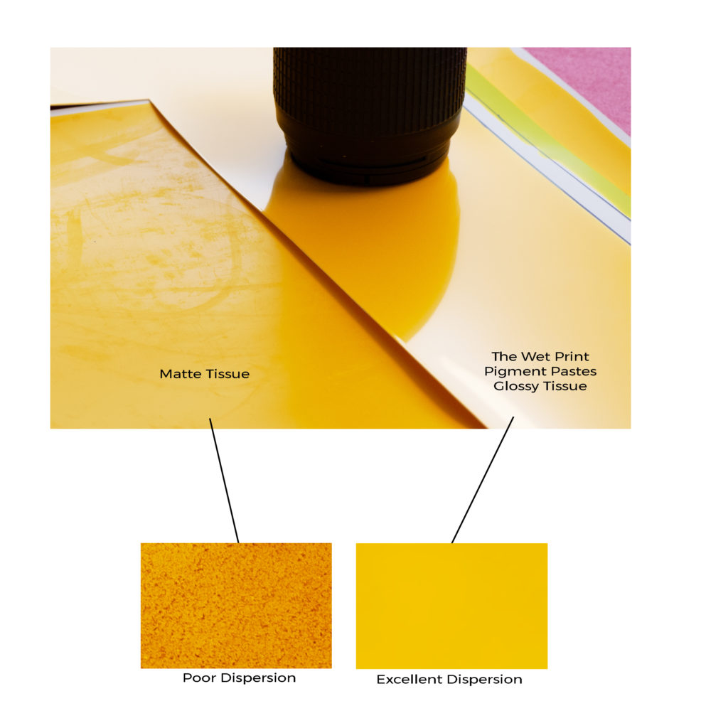
Dispersions with a small particle size and high stability will create more vibrant prints will smoother tones. A good indication of a quality dispersion is a glossy tissue and no sedimentation in the beaker. The dispersion must also easily mix into the gelatin.
TOXICITY
Using non-toxic pigments is important because they will eventually enter a wastewater treatment plant and later into the waterways and soil. Using a cadmium or chromium based pigment would be irresponsible since other pigments offering the same lightfastness and chroma are available.
LIGHTFAST
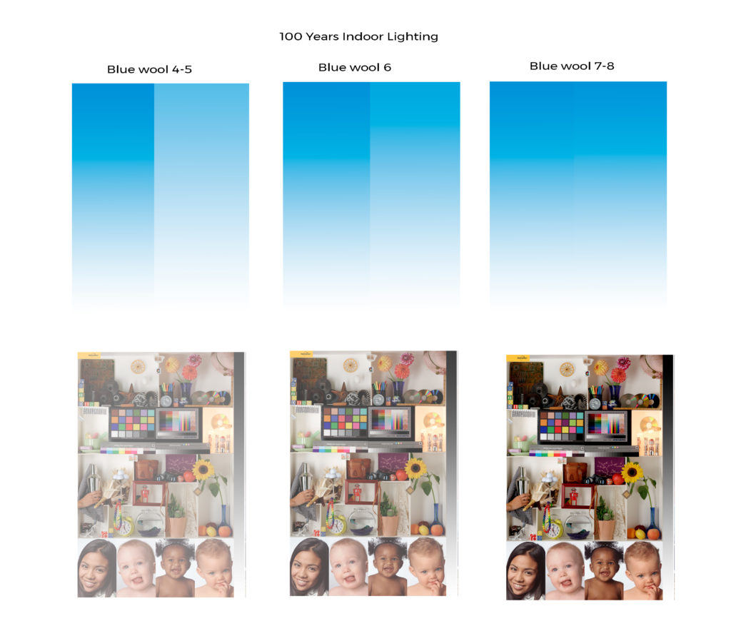
Making a print that is going to last hundreds of years is only possible if the right kind of pigments are used. Pigments with an ASTM rating of I or a blue wool scale rating of 7 or 8 will guarantee long lasting prints. The pigments used in The Wet Print color pastes all have a blue wool scale rating of 8.
HIGH CHROMA
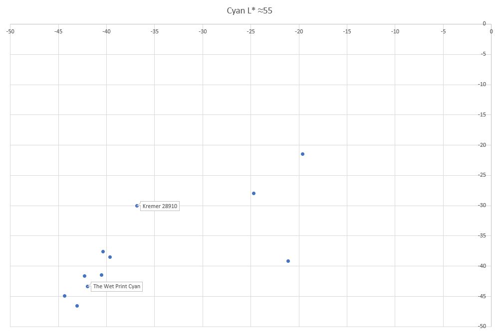
Chroma is a measure of distance away from neutral. It is calculated from the Lab color space by taking the square root of a2 plus b2. The further out from 0, the more vibrant the color. In the chart above the lower left pigments have a high chroma and the upper right have a low chroma. While The Wet Print cyan doesn’t have the absolute highest chroma of these samples, the other two caused staining.
NO OTHER DEFECTS

If the dispersion happens to pass all these tests there is still a chance it will cause some sort of other problem with gelatin in the tissue. These can range from emulsions that have an extremely rough surface, the formation of crystalline structures, bubbles, oil streaks, or unwanted hardening. A good tissue should be smooth and glossy, free from any defects.
CONTAINER

Storing the dispersions in the correct container makes a world of difference. If they are stored in a bottle, the pigments start to dry out which changes the weight to pigment ratio and makes calibration very difficult. When stored in large bottle like the Indian Ink, the ink dries on the inside of the bottle which will cause very small agglomerates even if shaken often. The Wet Print color pastes come in 50g aluminum watercolor tubes.
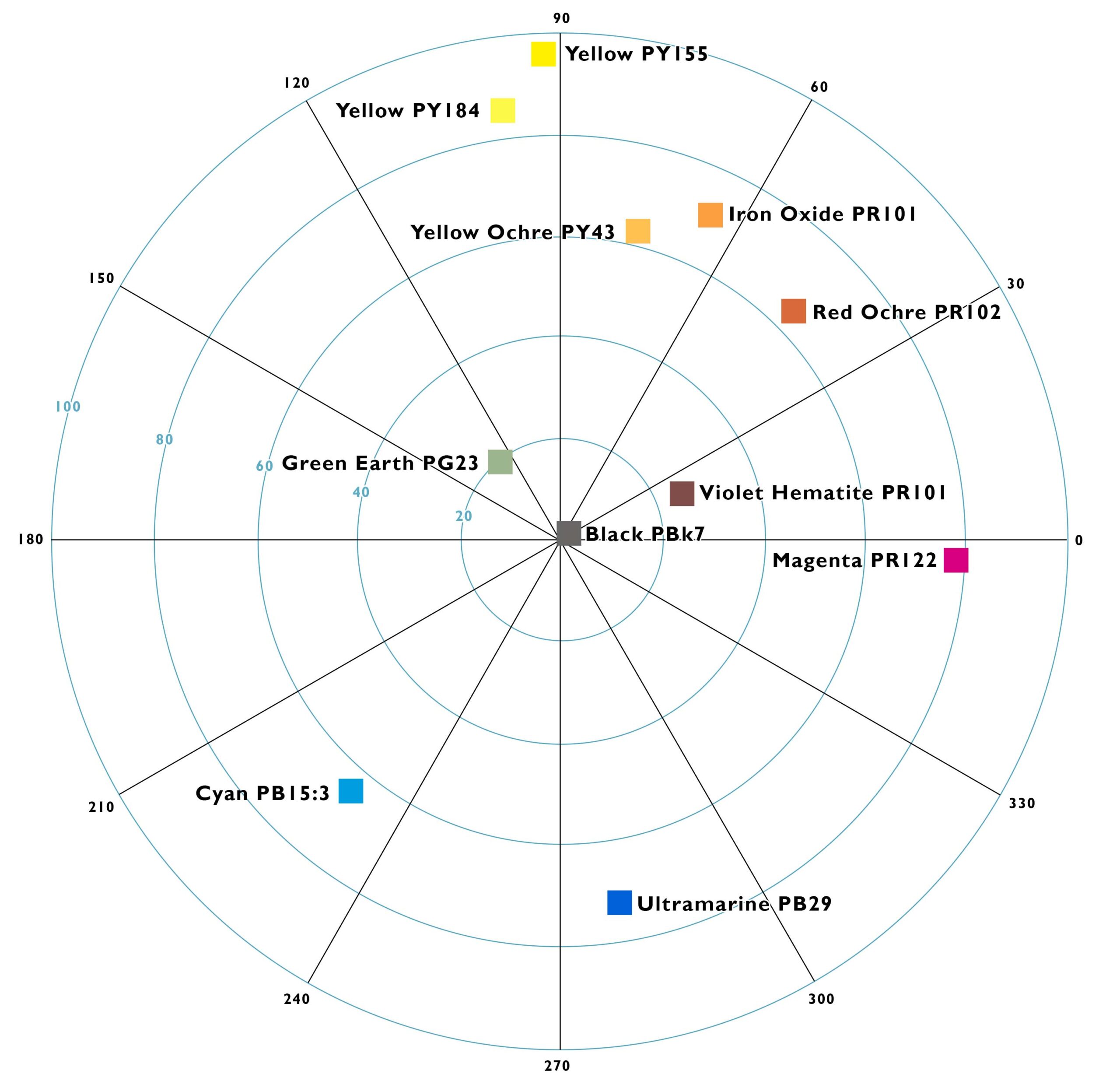
With advancements in profiling, editing software, and color science, it’s easier than ever to create and calibrate photographic prints that are not built from cyan, magenta, yellow, and black. We are free to break the mold, crafting works of art from an endless variety of pigments. Here are some examples-
• Earth pigments like red and yellow ochre, green earth, and lapis lazuli will create a very natural palette.
• The use of an iron oxide layer in addition to CMYK will greatly reduce metameric failure and color casts in portraits.
• The incorporation of brilliant green, violet, orange, or red pigments will greatly extend the gamut of a CMYK process. (Research into pigments for extended gamut is underway)
Designing a profile starts with choosing a palette. What pigments do we want to work with and what gamut will those pigments produce? After choosing pigments, the process of calibration can be divided into four parts, which are covered in Calibration for Alternative Photographic Processes. Once the profile is created, it’s easy to convert any RGB image in channels corresponding to the colors you chose for the palette.
Pigment choice is also important when toning prints. For example, the iron oxide and yellow ochre pigments are close in color, but the effect when toning a print is very different.
Brightly colored naturally occurring pigments are hard to find, so the price of these pigments tends to be higher. For example the price for the synthetic violet hematite in this store is almost half the price of the naturally occurring version. Natural ultramarine would be extravagantly expensive, so I use synthetic ultramarine, but if you are interested in the natural version, feel free to contact me. I have indicated which pigments are natural, and I guarantee they are what I say they are. Unlike Daniel Smith, which sells genuine purpurite, but it’s really just a much cheaper synthetic version. (https://www.instagram.com/p/CN9iDipFNT0/). There is a large variation in naturally occurring pigments, so I have purchased just about every one I could find, and tested them all for the attributes mentioned above. Below are just the red ochres I tested.
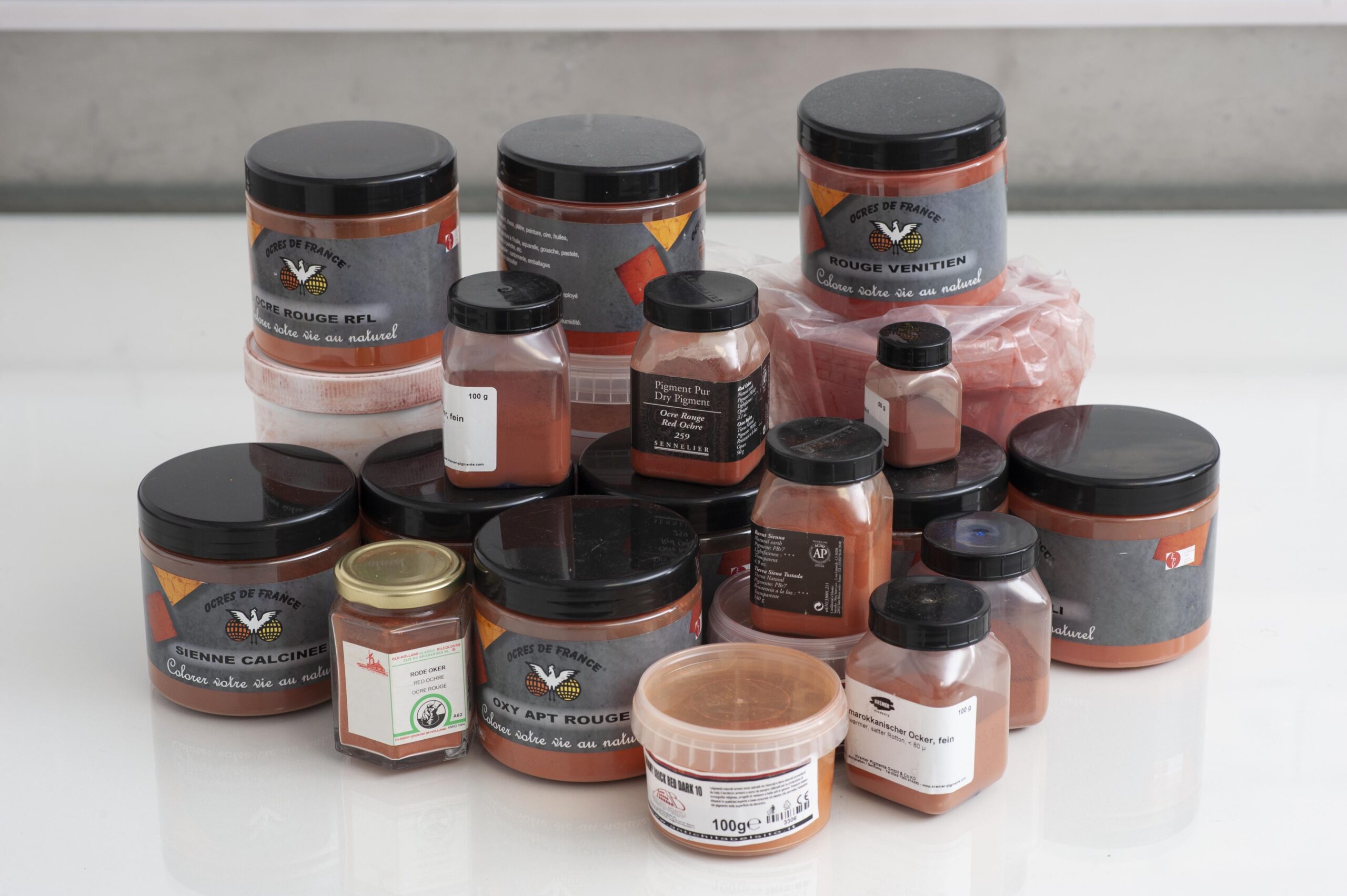
I could tell you which is the best, but it still wouldn’t be anywhere as good as The Wet Print color pastes. Why? These pigments are not finely ground. I further process these pigments in a planetary ball mill with zirconia jars and grinding media. The result is a more chromatic pigment that is also easier to work with.
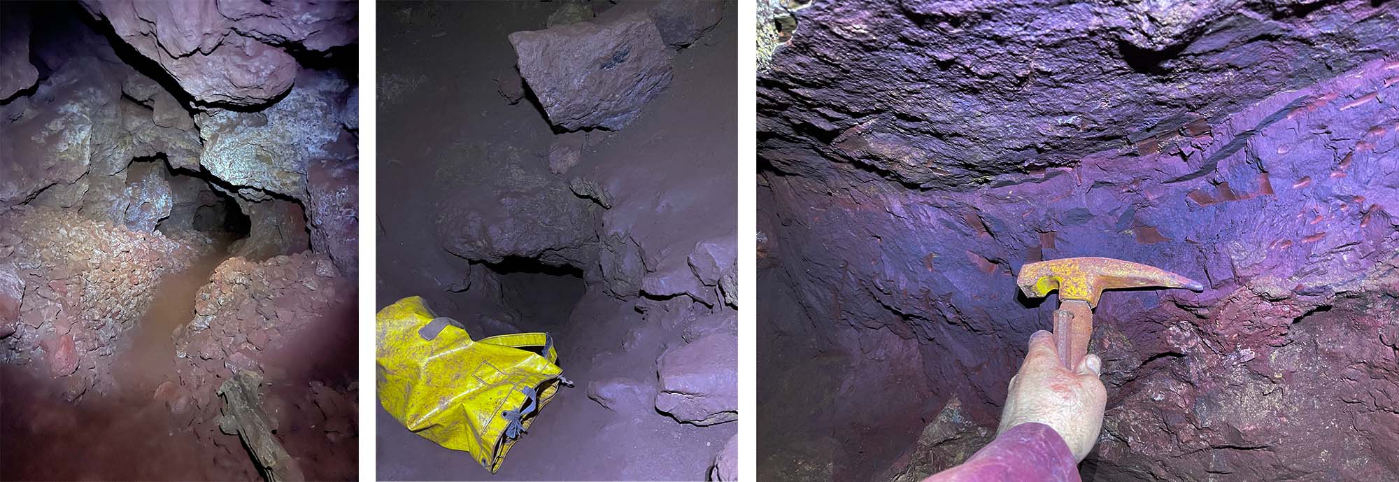
Sourcing these pigments is sometimes very labor intensive, which is definitely the case with the natural violet hematite. Below are some photos of Jonathan Wright crawling 80 meters down to collect ore from veins of violet hematite.
More information about pigments, and how to properly use The Wet Print color pastes, can be found in the Technical Guide to Gum Printing- https://thewetprint.com/gum/
Bruce MacEvoy’s website Handprint is also a great resource to learn about pigments- https://www.handprint.com/HP/WCL/water.html, as well as http://www.artiscreation.com/
For orders outside the EU, the minimum order amount is 100 euros before shipping.
“What bloom gelatin to you use?” That’s the first and usually only thing I ever get asked about gelatin, but it also happens to be one of the least important aspects in choosing a quality gelatin for carbon printing.
In order of most important to least important, here are the things to look for in a quality gelatin for carbon printing.
1: Staining
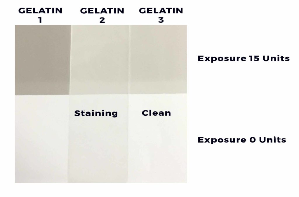
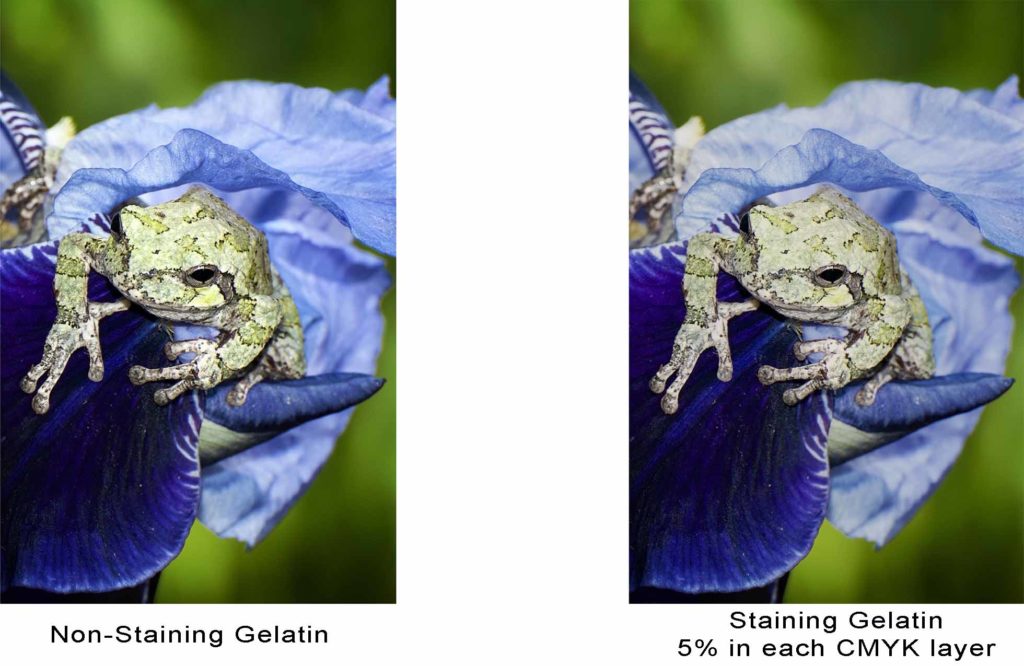
In the photo above you will see the middle gelatin caused the pigment to stain the paper. Instead of looking like the print on the left below with clean whites, if a staining gelatin is used then the print will look like the one on the right below.
2: Contrast
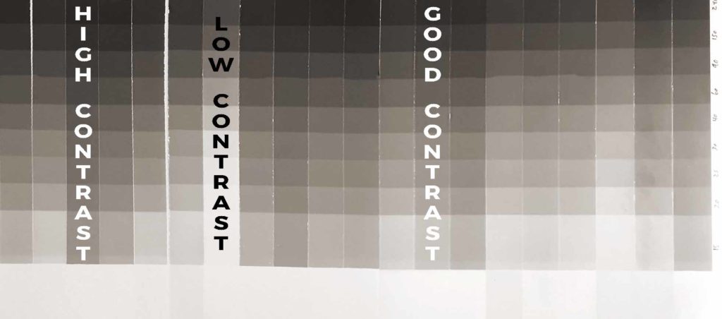
There are many ways to change the contrast of an emulsion, but changing the gelatin is often overlooked. This oversight can lead to frustration in getting clean highlights in a print, and deep rich blacks. In the test strips above, all tests were made with the same amount of pigment and sensitizer and exposed at the same time. The variation in contrast between the strips is quite remarkable. Use a gelatin that’s too high in contrast, and you will find that creating accurate tonal separations becomes an almost impossible task. Likewise, use a gelatin that is too low in contrast, and exposure times become ridiculously long. A good middle of the road gelatin is going to be the best for most prints.
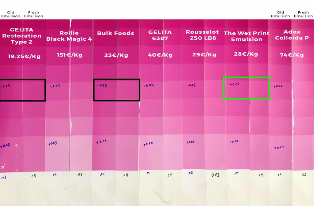
3: Stability
Some types of gelatin will cause an emulsion to change speed over time. Imagine shooting with ISO 100 film in January, but when you come back to use the film in June it has changed to ISO 200. Getting the correct exposure is like trying to hit a moving target. Below are some examples of stable and unstable samples of gelatin. The green square is best, while the black squares are going to make calibration a major headache. The numbers in blue marker are the change in density.
4: Clarity
When making color prints, using a yellowish gelatin will cause blues, turquoises, and cyans in the print to come out muddy. A clear gelatin will allow for brighter colors in a print.
On technical data sheets of gelatin samples the UV and visible transmission is usually indicated. To see if that has an effect on densities, I did a test by exposing patches of a single emulsion through 100 micron thick layers of dry gelatin. The variation of density between the various gelatin samples was minimal, so even a brownish gelatin is fine for black and white work.
For coating paper, clarity is by far the most important aspect to look at. A yellow gelatin will create a yellow paper when coated. A crystal-clear gelatin will give a nice clean look to a print, and the coating won’t be noticeable.
5: Bacteria
Below is a photograph of what happens when bacteria start to grow in an emulsion while it is drying. When poured the emulsion looks perfect, but when you come back in the morning, the emulsion is covered with small bubbles. Adding a bit of a biocide will prevent this, but using a gelatin that has a very low amount of bacteria to start off with will help and limit the amount of biocide needed.
6: Bloom
In the strip of tests at the top of this page, there are samples of gelatin ranging from 60 bloom to over 300 bloom, and they all work just fine. There might be a slight correlation between contrast and bloom, but it’s a stretch since the 60 bloom gelatin has the same contrast as some of the 290 bloom gelatins. The stronger gelatins take longer to bloom before melting and need a longer soak in the mating bath, but that’s about the only difference I’ve observed. That being said, usually the higher bloom gelatins are cleaner, and reserved as photographic or pharmaceutical grade by gelatin manufacturers, and tend to be more expensive.
7: pH
A gelatin’s pH is only important when working with dichromate as the sensitizer, which I strongly discourage for many reasons. However, if dichromate must be used for a specific unavoidable reason, a gelatin with a low pH will be more susceptible to the dark reaction due to the build up of chromic acid, leading to prints that come out too dark.
8: Mineral Content
I recommend a gelatin that has a low amount of calcium and other minerals, however, the cost for a gelatin with lower mineral content is also much higher.
9: Other Contamination
Modern gelatin is very clean, so it’s not often that you will run into problems with excess fat, ash, proteins, bone fragments, or gunk, but I’ve seen it in some very cheap technical gelatins. In food, photographic, or pharmaceutical grade gelatins there should be no problem.
10: Stickiness
After you soak an emulsion and squeegee off the excess water, take your finger and feel how sticky the gelatin is. Different gelatins and additives will affect the tack of the gelatin. In carbon printing, all we are doing is creating really fancy tape. If that tape is not sticky, the print will frill, detach, and bubble.
11: Hydrophobicity
It seems like some types of gelatin, more than others, become quite hydrophobic when taken out of a bath of water, squeegeed then resubmerged. This can cause problems with bubbles when mating to a temporary support.
Testing
Going through the process of testing different samples of gelatin is educational, and you will learn a lot, but testing all those aspects to find a good gelatin will probably cost over a thousand euros in gelatin, shipping, and materials, plus hundreds of hours testing over the course of a couple years. The multiple stability tests alone took me over two years to conduct. Then, if you find a gelatin that works well, minimum orders from manufactures are usually around 100kg, so plan on spending another two to four thousand euros.
I find this gelatin to work fairly well for emulsions.
If you find this information useful, please consider a donation.