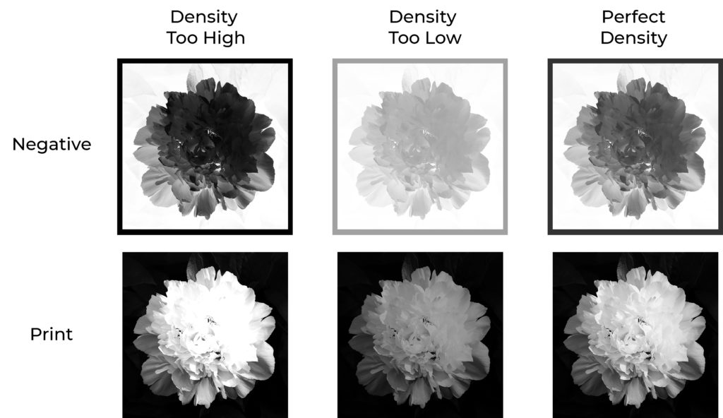
“If you set the density of the inkjet or in-camera negative too high for the process, or the exposure is too short, the highlights in the print are going to be blown out, as can be seen in the print on the left in the illustration above. Likewise, if the density of a continuous tone negative is too low, or the exposure is too long, then the highlights are going to be muddy, as can be seen in the middle print. To get the white point spot on, then the negative has to be perfectly matched to the process. Any difference in the process, for example, with humidity, temperature, exposure, etc. is going to affect the white point.”
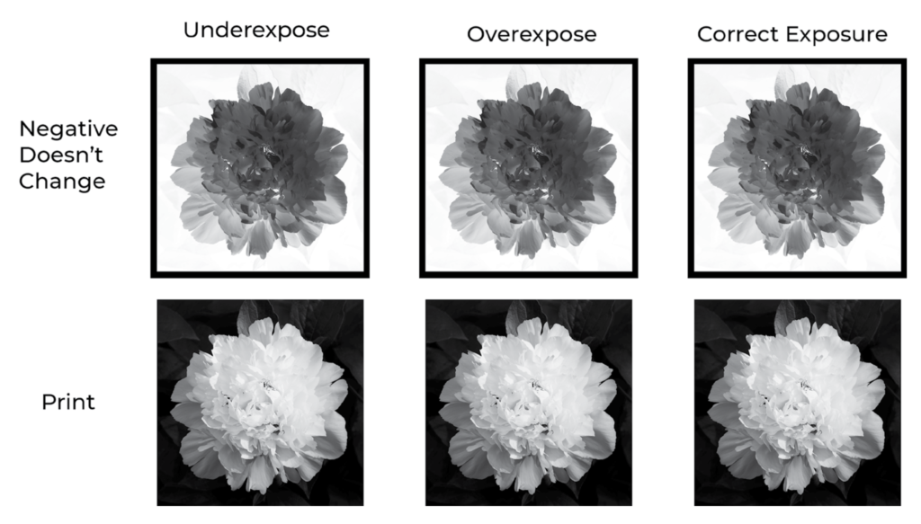
With a halftone imagesetter negative, “I can randomly choose an exposure time, randomly choose an alternative process with a random contrast and tonal scale, in a room set to a random temperature and random humidity, and the white point in the print will be absolutely perfect…every single time. This can also be seen in the illustration below, which is exactly the same as figure above but with a halftone negative. I didn’t indicate the density of the negative because that is irrelevant.” The book goes on to explain why the negatives work this way.
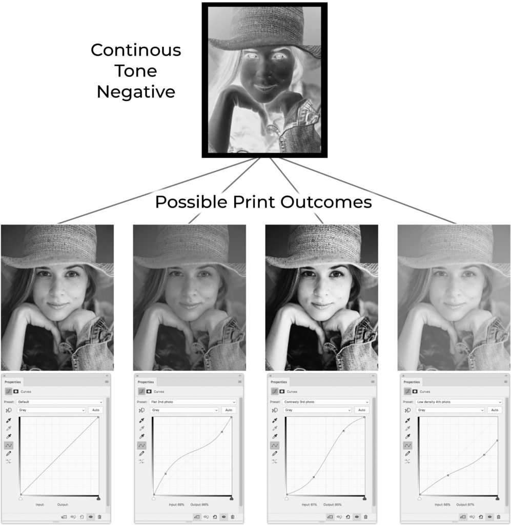
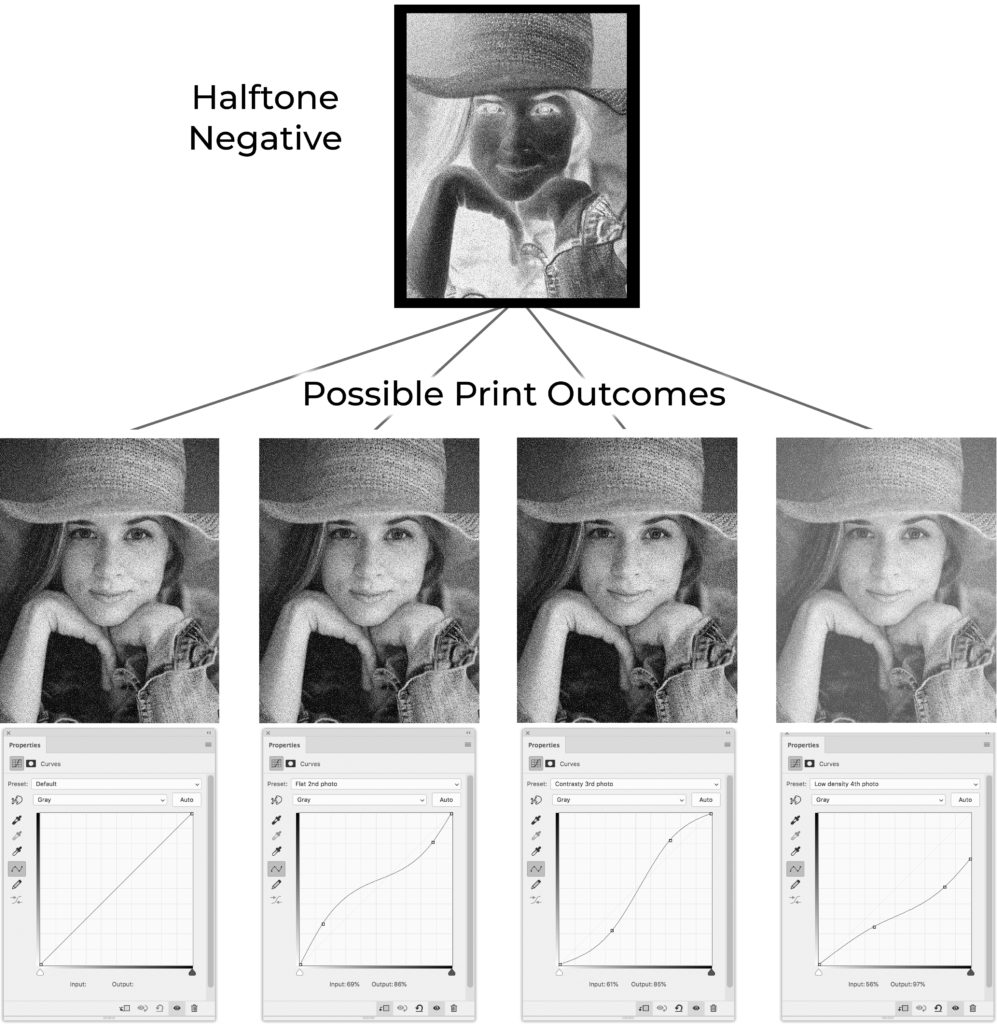
Continuous Tone Negative
“First, look at what happens in a print when the contrast of the process changes while using a continuous tone negative. Notice in the illustration below, how the prints change with the curves adjustments. These curve adjustments represent changes in contrast to the process due to variables like humidity, exposure, and temperature. Maybe you are making a platinum print and the humidity is a little lower than when you made the linearization. This will cause the contrast in the print to be lower and it will look like the second photo. Well, maybe not that bad, I exaggerated the effect for this illustration. For the third photo from the left, imagine you are making a carbon print and one emulsion has more pigment in it, which will cause the contrast to be too high. The fourth print is an example of the contrast lowering so much that it prevents getting a good dMax. In each of these cases, however, the white point is perfectly placed. Which, you would be quite lucky to achieve with a continuous tone negative. Even getting the white point perfectly placed, doesn’t mean the calibration is going to be accurate.”
Halftone Negative
“Here’s where people’s jaws drop in the workshops. In the illustration below are the exact same curves being applied to a halftone image. The first three images are exactly the same! This means that even if you are extremely sloppy with the process, not measuring pigments properly, not controlling humidity, etc. The prints are going to come out almost perfectly calibrated. This extends to variations of contrast within an image, which will include things like brush marks from sensitizing. Try printing a perfectly smooth sky with brush sensitized platinum with a continuous tone negative and you’ll be pulling your hair out. Try the same with a halftone negative and it will come out perfectly smooth even if you try to make it come out with some texture. Well, almost. Since the process will affect the dot gain a little bit, variations in the process will cause small variations in the print. However, these variations are magnitudes smaller than those seen in prints made with continuous tone negatives. The last image on the right is well calibrated, but the maximum density is lower.”
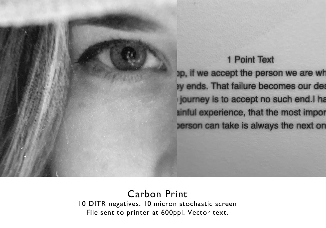
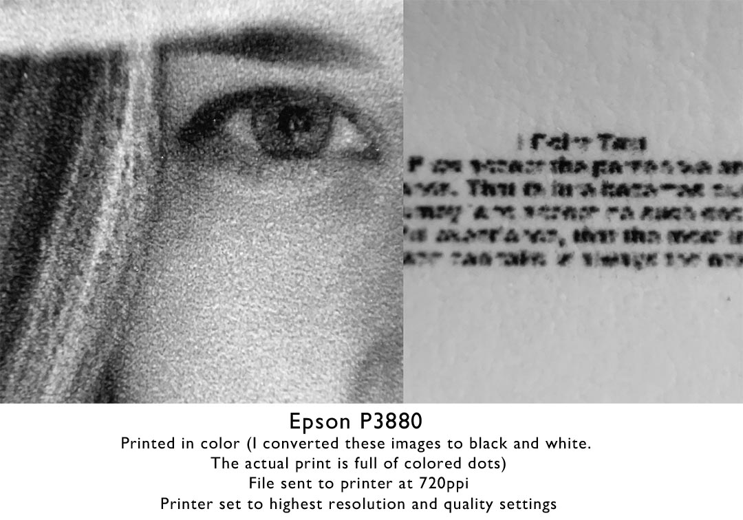
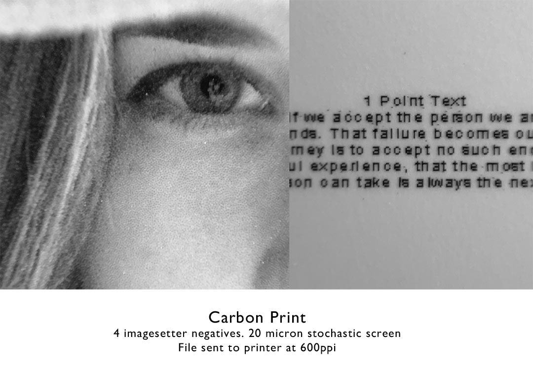
Below are samples of various prints made with different printing systems. The inkjet prints were sent to the printer at 720ppi, while the imagesetter negatives at lower 600ppi resolution. The image below is about 5mm wide, or about 3/16 of an inch.
Epson P20000 with ABW– This was by far the worst of the bunch.

Epson 3880– Normal color printing. I converted the photos of the prints to BW for the website, but the actual print is made up of colored dots.
Piezography– Way better dot placement with a 4900 and QTR than the P20000 with epson inks and rip. Having 7 inks makes a very smooth print. The print is still lacking any definition in the eyelashes and hair.

Imagesetter negative– I made a carbon transfer print with 4 negatives with a 20 micron stochastic screen. The eyelashes are defined and some skin structure is visible. This is the system I use for making black and white prints.
Imagesetter on DITR film– I went a little extreme for this example, using 10 negatives with a 10 micron stochastic screen, but the result is quite remarkable considering the image is only 5mm wide. The text comparison is a little unfair since I used vector text.